
SOFTWARE & SERVICE DESIGNER
Simplifying bike sharing with Austin B-cycle
user experience design case study (small)
my roles:rapid prototypingvisual designpresentation design shared roles:user researchuser flowspresentation client:Austin B-cycle team:three designers duration:one day (2016)

Problem: Austin B-cycle wanted to increase ridership and decrease support tickets by improving the first-time rider experience.
Process: Observe first-time experiences, find commonalities, and recommend actionable design changes, within scope.
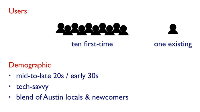
We introduced seven first-time B-cycle users to Austin's bike sharing program, performing contextual inquiry to gauge their thoughts, feelings, expectations, frustrations, and more. (My two design colleagues were also new to B-cycle.)
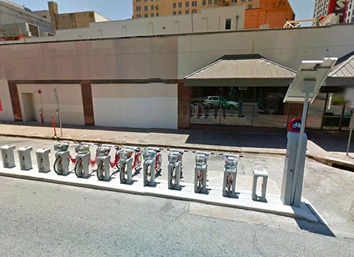
The station where we conducted user research
The immediate hang-up for our users: How to find a B-cycle station. Some searched online. Others downloaded an app. But both paths contained cumbersome decision points and technical hiccups.
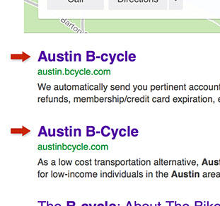

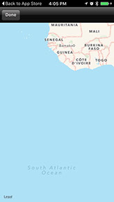
Left: Two websites for the same service. Right: The app drops us off in the South Atlantic.
Challenge: Austin B-cycle is technically a city-run nonprofit service, so we made sure to factor in their limited resources and design accordingly.
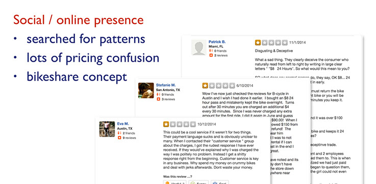
We took note of major user pain points, and compared them with any pain points shared online (social media, reviews, or articles).
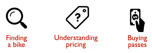
We were quickly able to consolidate these into three categories.
Pain points:
To address these, I compiled all my field notes with my colleagues', as well as with the pain points our research surfaced. With all of these together, we could focus on the most prominent issues and begin to differentiate solutions by scope: "minimal" or "la-la-land", in our case. I also mapped our solutions to whichever step(s) in the user journey they corresponded (pictured in the bottom of the center image, below).
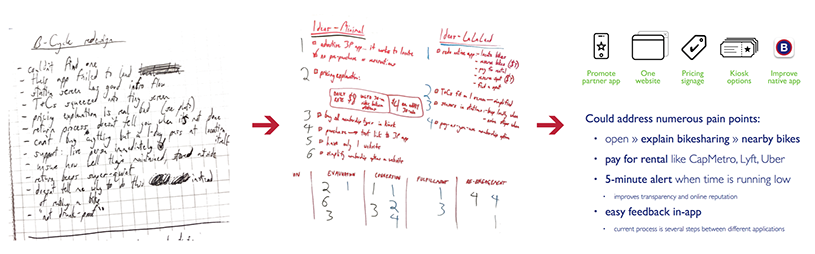
From field notes, to ideation/scoping, to design solutions
After some peer review, we organized our design recommendations into easily digestible categories. Despite it not being part of our assignment, I also took the initiative to polish our results, rally my team, and present these designs to the director of Austin B-cycle.
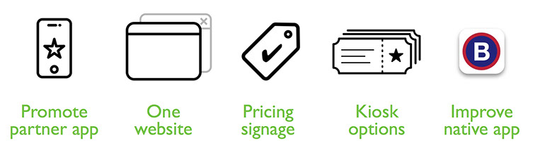
Solution: Five recommended changes to the B-cycle experience — two fairly easy, two simple-but-involved, and one resource-intensive.
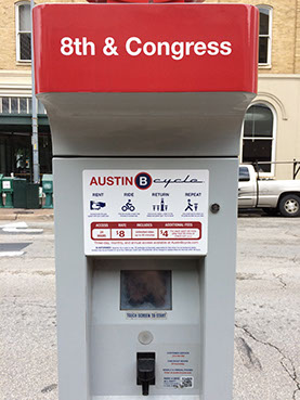
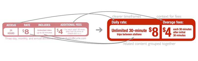
The pricing signage changes:
- reduce confusion over pricing timeframes, and group related content together
- emphasis on the 30-minute limit, which was overlooked in user tests and caused frustration
The software changes:
- remove the duplicate Austin B-cycle website
- enable purchase of weekend/week/month/year passes at kiosks
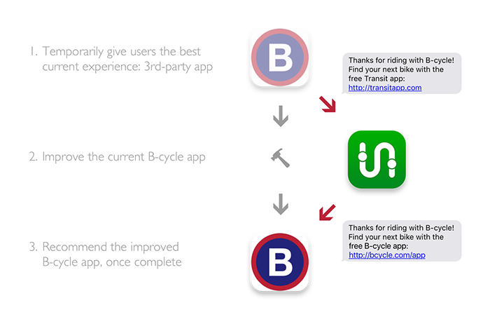
- temporarily direct users to a more functional third-party app that uses B-cycle's API
The proposed new native mobile application:
- explains the bike sharing process, benefits, and pricing visually
- allows simple in-app payment
- simplifies providing feedback or incident reports
- provides location-aware alerts when the user needs to return to a station to avoid overage charges
Outcomes: We took our own initiative to present our findings to B-cycle (this was not originally part of our brief), which were appreciated and passed along as feedback to their software development team. A high-resolution copy of the pricing signage was requested, and is being put into action soon.
"these findings are right in-line with the direction the b-cycle app is taking."
— elliott, director of austin b-cycle
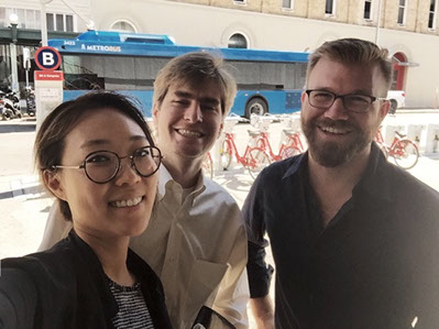
My design team, after our presentation to Austin B-cycle
Retrospective: This project actually begin as a simple, one-day "design blitz" type of exercise. But I saw value in our findings, and suggested that my team polish them and present them to B-cycle. As a result, a variation on our pricing signage is being rolled out soon, and I've been looped into the pilot program for their new mobile app. It's wonderful to see our insights put to use and helping get people involved in active transportation like cycling, instead of being bottled up in a design studio. It's this kind of impact that makes me excited about the power of experience design.
Below you can view the presentation deck (presentation notes not included) or more designs.
Iconography credits:
Magnifying Glass by Michal Beno from the Noun Project
Blank tag by Straw Dog Design from the Noun Project
Payment by Gregor Črešnar from the Noun Project
Star by Jetro Cabau Quirós from the Noun Project
Browser window by Magicon from the Noun Project
Close window by Magicon from the Noun Project
Tickets Star by Viktor Vorobyev from the Noun Project
presentation »
on slideshare
« more designs
on homepage
© 2018 Robert Boler. Don't steal content. Shame on you.