
SOFTWARE & SERVICE DESIGNER
Modernizing car rental with Hertz
user experience design case study
my roles:comparative analysisuser surveysinteraction designpresentation design shared roles:user researchuser flowsuser testingvisual design client:Hertz car rentals team:two UX designers duration:two weeks (2016)
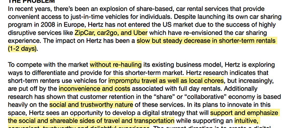
Problem: Hertz saw a decrease in short-term rentals due to the rise of new transportation services like Uber, Zipcar, and Car2Go.
They want to join the sharing economy to compete with these disruptive outfits — our challenge was doing so without upending their existing core business.
Key points from the brief
Process: Start with the users: both those who have rented cars and those who use newer sharing services.
Why did they leave? What don't they like about renting? How can Hertz leverage their brick-and-mortar locations and diverse fleet of vehicles? We started by getting all of our initial questions down on paper:
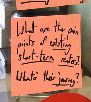
One of our many initial questions
We split up the competitive and comparative analyses between ourselves and starting digging. Tracking our daily progress on a modified scrum board ensured we left enough time to test and refine our designs.
To get qualitative insight into how people use different transportation services, we conducted two online user surveys (a broader transportation survey, and a follow-up targeted at rental car users). The surveys revealed that most people didn't actually leave car rentals for the services Hertz expected, and a few key pain points came into focus.
Pain points:
- the inconvenience of waiting in lines,
- a mistrust of Hertz salespeople, and
- unclear expectations around pricing and reservations.
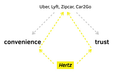
It turned out that some of Hertz' weaknesses were the very attributes upon which the newer transportation services built their services. (Hopping in a stranger's Lyft car requires a lot of trust, and being able to jump into any nearby Car2go is very convenient.) More surprisingly, most users didn't actually replace car-renting with ride-sharing — they didn't rent a car for their ride-sharing use cases to begin with:
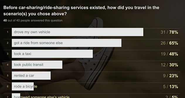
Most users we surveyed never rented a car for their newer ride-sharing use cases
"the rental process is slow and inconvenient. i personally hate having to visit the rental car company building."
— kyle, user survey participant
Competitive analysis of the Hertz, Uber, Zipcar, and Car2Go user flows made it clear that renting a car takes considerably more effort and paperwork than using any of the other services:
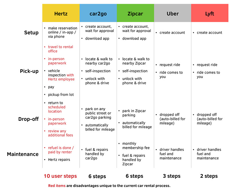
Competitive analysis of different services' user flows
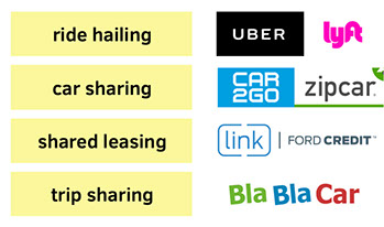
Each type of transportation service we compared
One challenge was the sheer breadth our research had to cover. We picked apart the car rental process, and four adjacent industries. Reducing every service to a list of attributes allowed us to see where they overlap, what’s been done, what makes sense together, and in which direction it would be most beneficial for Hertz to grow:
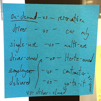
The core attributes of any transportation service
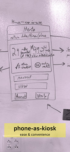
We mapped out and considered various solutions, each addressing pain points in various degrees:
- airport valet/pick-up (the speed of Uber)
- in-town car sharing (the convenience of Zipcar)
- "sub-renting" cars that are already rented out (sharing the cost)
![]()
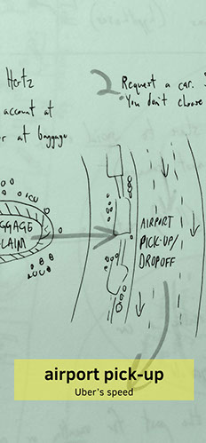
Three solutions we considered
In the end, all of these solutions require significant simplification and automation of Hertz' current rental process — improving that rental process is a worthwhile and significant change on its own. We enabled the phone to replace the rental office.
Solution: a Hertz mobile app that handles the entire car rental process
The native application:
- enables customers to reserve, pick up, and return a car with only their phone (convenience)
- is communicative about costs and other expectations throughout the process (trust, clarity)
- saves users as much repeated work as possible with a robust Hertz user account (convenience)
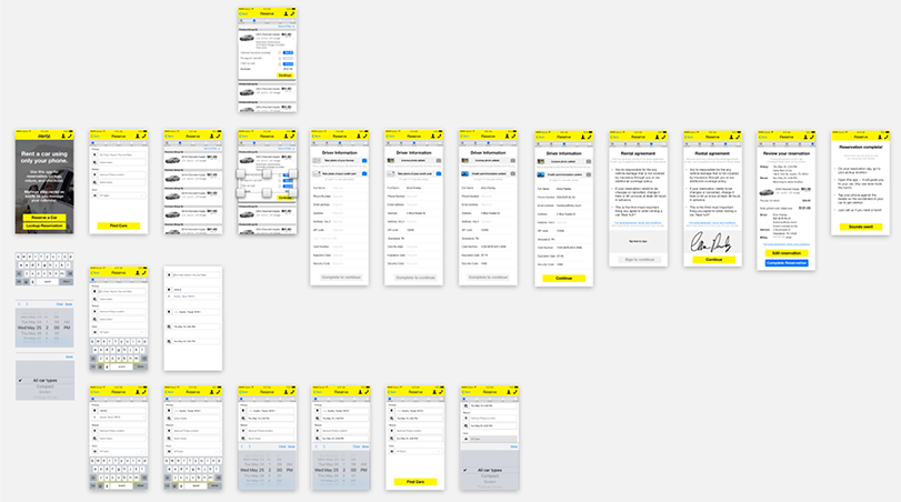
We used Sketch to create high-fidelity mock-ups. (Here: the reservation flow)
This would also lay the groundwork for any future sharing or hailing services Hertz may wish to start.
How we illustrated our design decision to explain it to the client
Since this end-to-end mobile rental process is totally new, we wanted to keep some familiar things in place for current users — namely the visual design of the Hertz app. Home screens with multiple text-labeled buttons aren’t sexy, but they communicate options clearly for what could be an unnerving new experience for existing users.
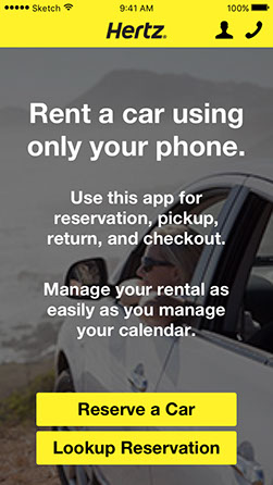
Left: previous design. Right: new design explains new service + omnipresent phone support.
Outcome: We delivered a well-received presentation and interactive prototype to our mock-client (standing in for Hertz: Chris, a designer at Frog).
"you convinced me of your design decision within the first few minutes. beautiful prototype."
— chris, guest project judge and ux designer at frog
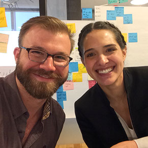
Celebrating with my design partner, Emerald
Retrospective: Given the chance to repeat this project, I would set aside a budget to go through the whole car rental process in-person, and spend more research time with people who rent cars regularly. I’d also go grab a drink with my colleague ahead of the whole project, so we could spend time sharing how we each work, communicating our strengths and weaknesses, and just getting to know each other instead of doing so in smaller bits throughout the project.
Below you can view the interactive prototype, the presentation deck (presentation notes not included), and more designs.
prototype »
on invision
presentation »
on slideshare
« more designs
on homepage
© 2018 Robert Boler. Don't steal content. Shame on you.