
SOFTWARE & SERVICE DESIGNER
Matching homeowners & contractors for Renovate Simply
user experience design case study
my roles:user interviewsuser flowspresentation designproject management shared roles:user testingrapid prototypinginteraction designvisual design client:Renovate Simply team:two UX designers duration:three weeks (2016)

Problem: Homeowners need a simple way to understand the approximate cost of their renovation projects, and find trusted contractors for them.
Renovate Simply uses the aggregated data from past local home renovation projects to predict the cost of new ones. Using the information a homeowner gives them, they're able to qualify compatible contractors based on a variety of factors and get them in touch.
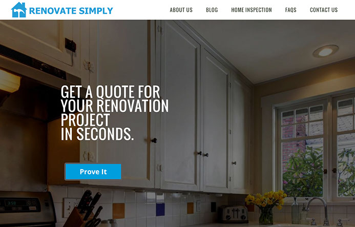
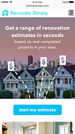
Renovate Simply's existing homepage
They had built a website and outsourced a native iPhone app to help homeowners and realtors get these estimates, but many homeowners abandoned the flow before receiving their estimate. They knew there were improvements to be made, but wanted their decisions to be based on user research instead of personal taste.
Given our client's limited development resources and the short timespan of this project, we arrived at three main areas of interest:
- Improve the current homeowner renovation cost estimation flow, specifically on mobile
- Look into what future features will be most needed
- Determine whether a native application or a mobile website is the best medium
Process: Interview users to get a real understanding of their pain points around renovation projects. Take them through the current flow, and see where problems arise. Redesign the flow to avoid those hangups, and rapidly test variations with as many users as possible.
My designer partner did a competitive/comparative analysis of any similar home renovation or matchmaking services. We identified any homeowners who had undertaken renovation projects or planned to in the near future, and did 30-60 minute interviews with them in-person and over the phone.
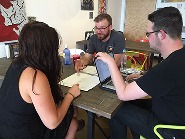
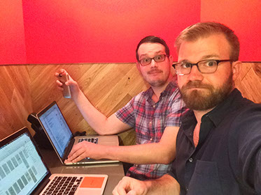
Left: In-person interviews allowed the most depth. Right: Cranking out user interviews in our tiny (and toasty) phone booths.
"I can do my own online research, but i just don't know what i don't know. this is new to me."
— nicole, interviewed homeowner
We also interviewed two realtors and a contractor for context. After interviewing more than six homeowners with a variety of home-owning and renovation experience, we were able to identify some clear values and pain points:
![]()
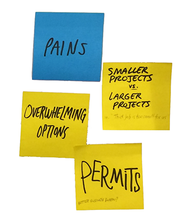
Challenges: How can Renovate Simply help homeowners find contractors when all of our interviewees (and half of all homeowners) do this strictly through word-of mouth? And if homeowners actually like comparing contractors, would they even appreciate a matchmaking service?
We spent some time scribbling down ideas and interface elements, a mixture of direct user requests and inferred needs:
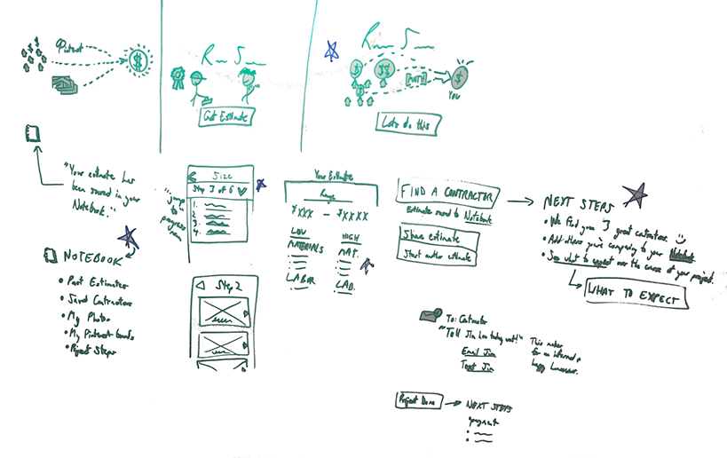
This gave us enough direction to mock up two variations of a redesign on paper, which we tested in-person or remotely, via InVision:
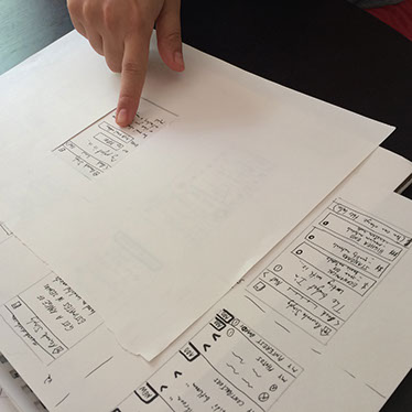
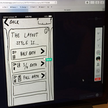
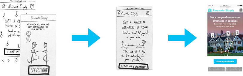
Now informed by a few tests, we were able to combine the most successful elements of the two prototypes into one, and test with more users. From there we were able to begin wireframing and test a high-fidelity digital prototype. In total, we test 4 different designs with 9 different homeowners.
Guiding these designs were four main insights from our interviews and tests:
- Build this flow as a mobile website to increase usage and take advantage of in-house development resources, instead of a native application.
- Don't fight users' comparison process - augment it. Offer three qualified contractors (the sweet spot, per our user interviews) instead of just one.
- Create value for users who seek contractors via word-of-mouth referrals with a new feature that helps them organize all of their renovation information together, called the Project Notebook. Users loved this in our tests.
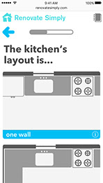
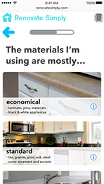
- Use more graphics instead of photographs when asking specific questions in the estimation flow (e.g. room size, room layout). Using photographs for all questions shows too much information at once, but graphics can be tailored to only illustrate the question at hand.
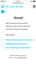
We also added written copy at the beginning of the process, at key problem points, and after the process to set up expectations and actionable next steps.
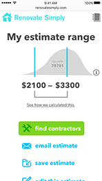
Solution: A new, mobile-focused web app for Renovate Simply that sets expectations and communicates context before, during, and after the project estimation process.
The mobile website:
- Clearly explains Renovate Simply's benefits and what to prepare for over the course of a project (e.g. permits, unexpected labor, project timeframes, etc.)
- Helps homeowners organize their project and add external information (e.g. word-of-mouth contractors, photos of the room to be renovated, links to pages like Google Sheets or Pinterest boards) so it's all stored in one place
- Uses focused visuals to make each step of the estimation process as seamless and natural as possible
Outcome: Delivered a well-received case study presentation to the client, with some design recommendations already on their way to production. (See below for prototype and presentation.) The client even approached me later for additional user research.
“we've done a few of these kinds of consultations before, but this has by far been the most valuable yet.”
— will, ceo, renovate simply
Retrospective: Renovate Simply has a unique service to offer homeowners and contractors, and is addressing real pain points. They're on the right track -- they needed evolution, not revolution. Despite the fanfare that accompanies new products, the most impactful design improvements are often gradual, iterative changes that make an experience more natural. In fact, we ditched some of our more edgy design ideas after user testing, including an animation that visually displayed the estimation range narrowing as the user answered questions.
On this project I also served in a project management role, scheduling user interactions for our team and keeping us on schedule with a modified Scrum board. In the end we were further along in the process than some of the other projects my cohort, with more user testing involved, which is a testament to the power of knowing when to stop your current work and move to the next step.
Below you can view the interactive prototype, the presentation deck (presentation notes not included), and more designs.
prototype »
on invision
presentation »
on slideshare
« more designs
on homepage
© 2018 Robert Boler. Don't steal content. Shame on you.